Expressive Letter Book Covers
Modern book covers with three different lettering designs of expressive ‘Drop Cap’ for young audiences. The expressive letter style fits the trend for young students. The style appeals to students in reading the classic novels.
I used a hand-drawn ‘Drop Cap’ for this book, which is a popular expressive way for the letter. I made several sketches of the letter P inspired by the story, and used Illustrator to draw and finalise it into a normal letterform.
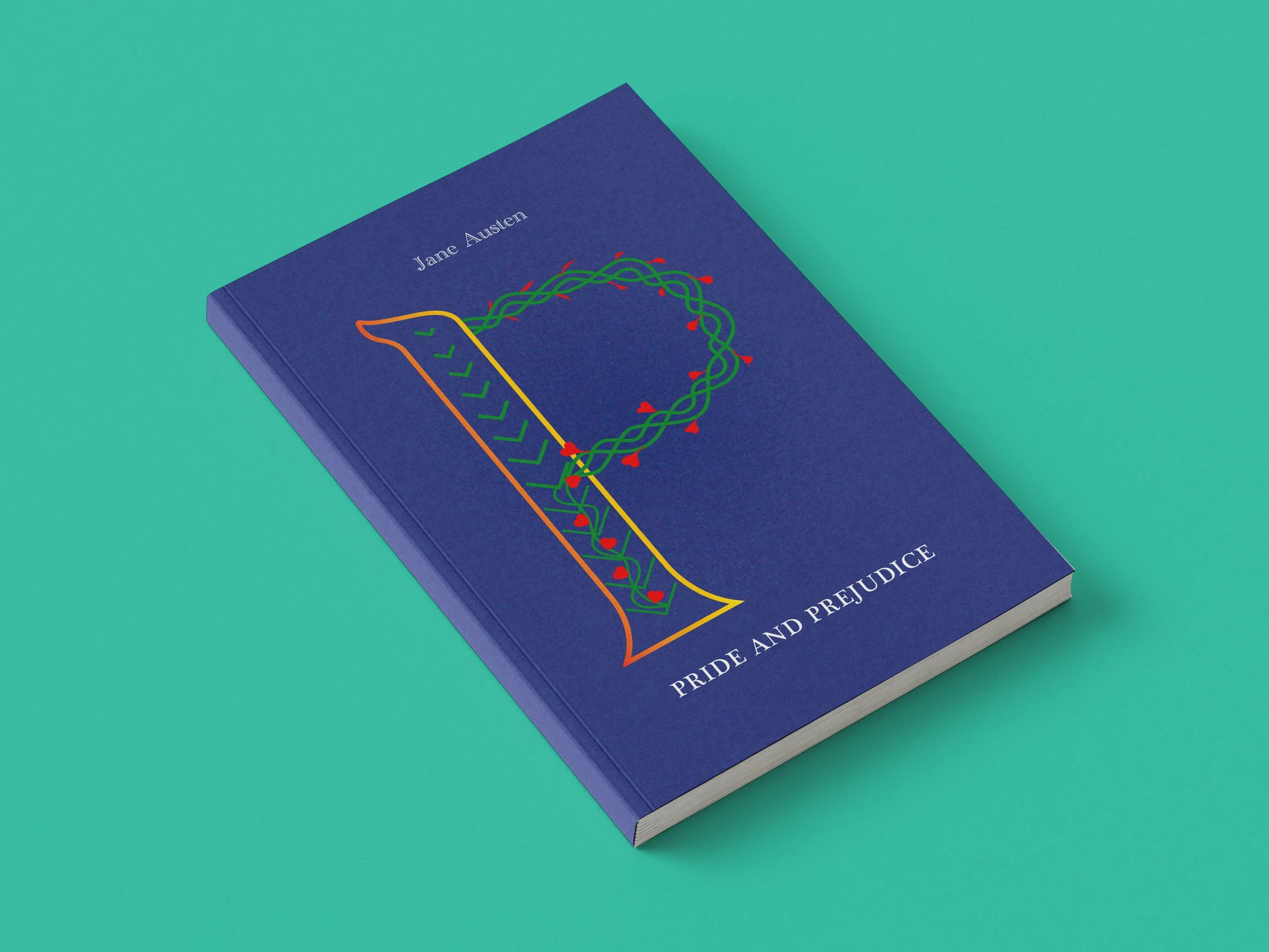
Pride and Prejudice
I used a digitally drawn ‘Drop Cap’ for this book, which fits the adventure theme of this book. I sketched all the major elements in the narrative, such as the boat, gun and island, etc.. Finally, I used the island for the Letter R combined with other elements to express the novel.
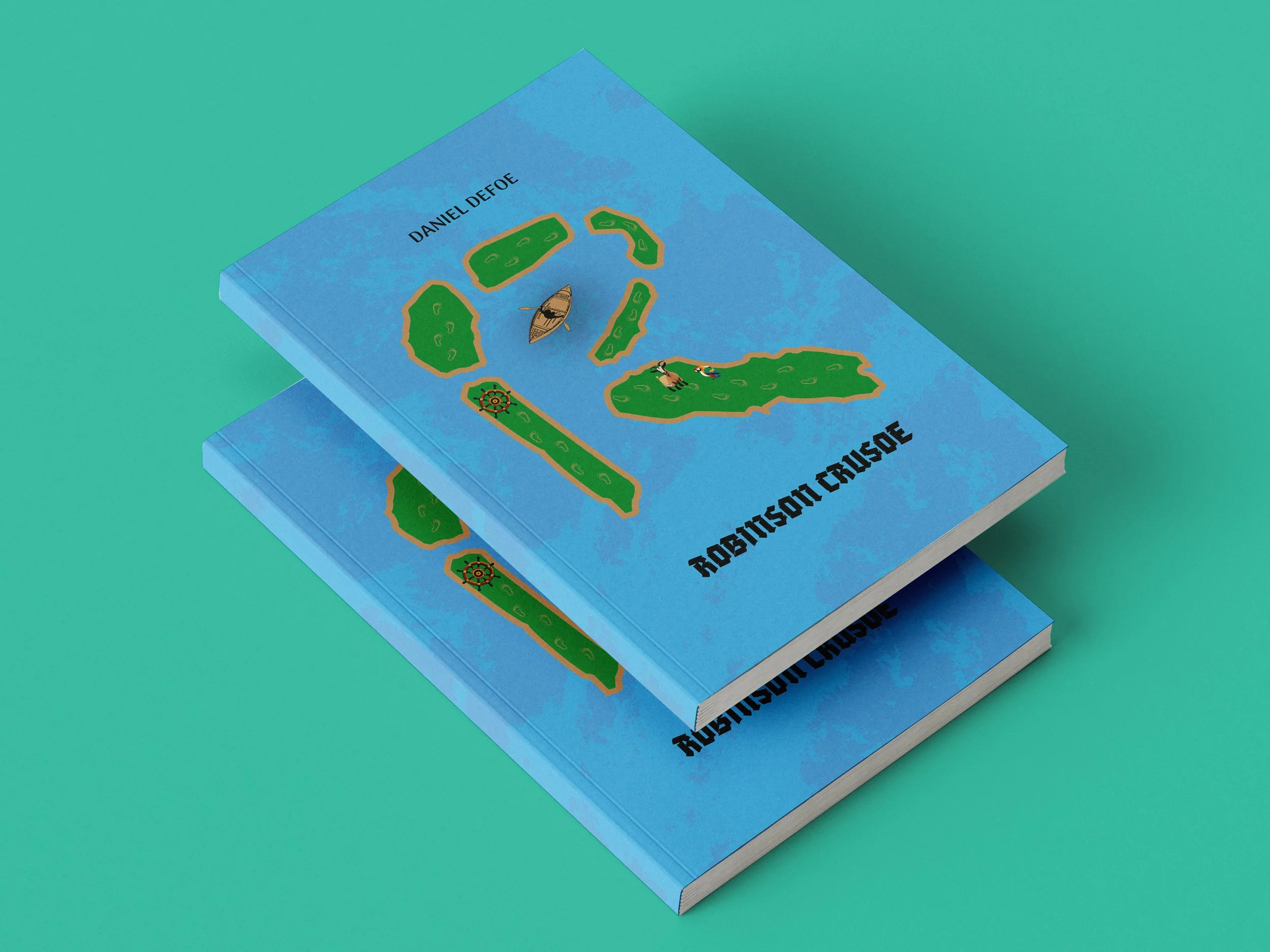
Robinson Crusoe
I used a constructed ‘Drop Cap’ for this book to give the cover a 3D effect. As the story's plot, the theme is about how women fall in love. So I used a brain activity scan of women falling in love and extracted the section resembling the letter S to create the cover design. Then I lay a brain cell around it to create a 3D effect.
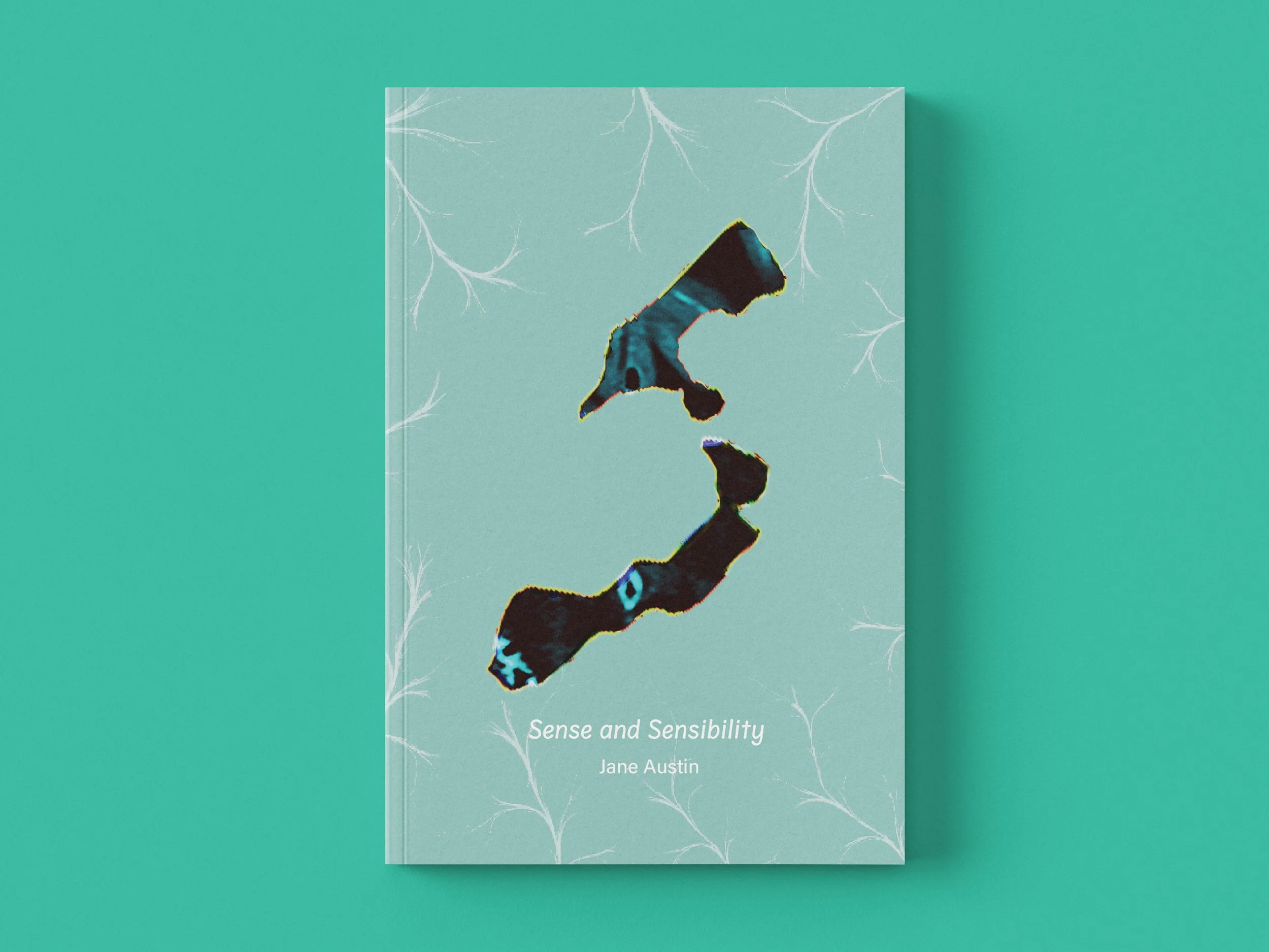
Sense and Sensibility
-
Griffith University assigned me a task to design three book covers using the expressive letter of the first Capital letter of the book name. The three books are famous English classic novels: Pride and Prejudice, Robinson Crusoe, and Sense and Sensibility, but will be sent out for university students to read.
-
Modern book covers with three different lettering designs for each book of classic novels: hand-drawn, digitally drawn and constructed ‘Drop Cap’ for young audiences. The book covers fit the trend for young students and make them interested in reading the books.
-
Make the cover style consistent with the novel’s plot.
Use the trendy book cover design method.
-
At first, I gathered all the documents online about David Carson and laid them out on Adobe XD. I reviewed all his works, personal life story and present life. I used his images to do the collage with color blocks. I did the layout in his style, not to follow the grid system. I added some hover status on Adobe XD to make the navigation experience more interactive and interesting. I designed the website for three different devices, which allows users to navigate with the device in their hand.
-
A single page for a desktop.
A multipage site for a tablet.
A multipage site for a mobile phone.